Saturday, July 11, 2009

Weighted Color Proportions

When I give a color recipe THE PROPORTIONS ALWAYS REFER TO LIQUID DYE. And my liquid dyes contain different concentrations of powdered dye depending on the color group. By changing the concentrations by color group, I'm less likely to need to use large measures for one color and tiny measures for another when I combine liquid dyes.

Reds are strong; yellows are weak; and it takes a lot of black to make black. I use less dye for the reds and more for the yellows & blacks. The blues are my standard. I add 1 teaspoon red or 2 teaspoons blue or 3 teaspoons yellow (or black) powdered dye to 320 ml (about a cup and a half) of urea water (1 cup urea to 1 quart of water). I might make the concentration stronger on certain occasions.

TO TRANSLATE these weighted proportions to actual proportions of powdered dye...

Leave the red amounts alone.
Multiply each blue amount by 2
Multiply each yellow and black amount by 3.

(You may be able to simplify at this point, for instance 3:6:9 is the same as 1:2:3.)

I use the U.S. system for dry measures and large amounts of liquid, and metric for small amounts of liquid. (Mixed up, I know, but it works for me.) I always mix my liquid dyes to a standard concentration (below), then measure out the liquid according to the proportions in the recipe.


REDS


BLUES

YELLOWS
& BLACKS

1/32 teaspoon

10 ml

5 ml

~ 3 ml

1/16 teaspoon

20 ml

10 ml

~ 7 ml

1/8 teaspoon

40 ml

20 ml

13 ml

1/4 teaspoon

80 ml

40 ml

27 ml

1/2 teaspoon

160 ml

80 ml

53 ml

1 teaspoon

320 ml

160 ml

107 ml

2 teaspoon

640 ml

320 ml

213 ml

1 Tablespoon

960 ml

480 ml

320 ml

4 teaspoons

1280 ml

640 ml

426 ml

5 teaspoons

1600 ml

800 ml

535 ml

2 Tablespoons

1920 ml

960 ml

642 ml


For the tiny amounts I use measuring spoons from a gourmet shop labeled pinch, dash, and smidge, which are 1/8, 1/16, and 1/32 teaspoons. Even so, things aren't very accurate in these amounts, which is usually OK for me. If accuracy matters, I paste up more than I need, and measure the liquid accurately.

Before getting started, I work out how much total dye I need for the amount of fabric and depth of shade I'm going for. Let's say I'm dyeing a quarter yard a dark and even purple, requiring 500 ml of liquid dye. For a color recipe of 3 parts Fuchsia to 7 parts Turquoise, that works out to 150 ml of Fuchsia and 350 ml Turquoise. I look on the chart to find the next larger amount of each color. For Fuchsia I'll mix 1/2 teaspoon powder into 160 ml of urea water. For Turquoise, I would mix up 1 and 1/4 teaspoon powder into 360 ml of urea water. I'll measure out the exact amounts and dye my fabric in it.

Monday, July 6, 2009

Oh How Red will Bleed...


So I get really impatient rinsing out dye. The studio is upstairs at the back of the house, and the washer is downstairs, and for such a small amount of fabric it seems silly to run the washer, right? Wrong.

I know that red is generally the most likely color to run, and I know I'm supposed to rinse until the water looks clear enough to drink. But do I have to? Here's some pretty clear rinse water, next to plain water for comparison.

I took the fabric rinsed in that water and set it, damp, on some white fabric. When a friend washed a red & white quilt my sister had made, she laid it out on a patio table to dry. The bits lying flat didn't bleed, but the parts hanging down over the edge did. So I set my stuff vertical, on a board. Will it bleed?


Uhh, yes.


So my lesson has been learned.

As I rinse and rinse fabric by hand, I have wondered what factors are most effective at really rinsing? What matters most? Very hot water? Lots of water? Many changes of water? Letting it soak? Agitation? Enough synthrapol (detergent for dye)?

I don't know the answer, but my current intuition is that agitation is what you want a lot of, and the washer can do that way more better than I can (or have patience for). My new approach is to:

* pull the fabric from the dye
* rinse it in the sink enough that it won't easily bleed against itself or another piece of fabric
* hang it dry not touching something else
* set it aside until I have a reasonable amount of fabric for the smallest washer load, and run it three times (with synthrapol)

And if I have some fabric that's been machine washed already, I might throw it in the washer with another batch on its second round.

When possible I've been ironing the damp fabric right after taking it out of the washer, just because it looks so BEE-OOOTIFUL all steam pressed. It's one of those magical transformations, like blocking a sweater or fulling some handwoven fabric, or pressing a quilt block.

Green, Greener, Greenest


Today's investigation concerns dye concentration. When working with something like watercolor or ink, it's pretty obvious that diluting with water will make a color paler. I thought dye was different. You put four things in a dyebath: fabric, dye, various helper chemicals, and water. I thought the depth of shade was all about how many grams of dye vs. how many grams of fabric. How long the fabric swirled in the dye bath mattered, but the amount of water didn't, beyond having enough to let the fabric move freely.

But that's all for regular dye baths, and this is low-immersion dye bath. And it would appear that the dye-to-water ratio matters. A lot.

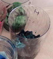
Here's the test.I put identical amounts of green dye (1 part Fire Red, 8 parts Lemon Yellow, 6 parts Cerulean, using my weighted proportions.) into each cup, and added 10, 20, 40, 80, 160, and 240 ml of water to each cup. Each cup got a 5"x5" square of fabric. After 20 minutes I added a teaspoon of soda ash solution to each cup. Then they sat for 2 hours.


The results are clear. More water, lighter shade.


Here are the fabrics all rinsed out.


The next question was how much the amount of fabric matters. I made two concentrations of the same brown dye, one four times as strong as the other. I put a 5"x5" and a 10"x10" square in each concentration. The four cups have the same amount of liquid.


(Sorry the order isn't logical; big squares are on the outside.)

Before the fabric is rinsed out, the impact of dye concentration is exaggerated.

Here they are after washing out excess dye. Just like with the green test, dye concentration matters the most, but the amount of fabric matters too. The small squares show the impact of dye concentration more clearly. The big squares are pale and paler, so the difference is less obvious.

The two darker squares on the right both had the same dye concentration and the same total amount of dye, but the larger square had 4 times as much fabric, so it's paler. The difference is less dramatic than between the two small squares, but it matters.

The darker large square and the paler small square had the same proportion of dye to fabric in identical amounts water. The one in the higher-concentration dye-bath is darker.

This tan is 5 parts Fire Red, 3 parts Lemon Yellow, and 2 parts Cerulean Blue. It's pleasing to make a real neutral. On my screen, this looks a little pinkish, but in life is just a little too green. Next time I'll up the Fire Red just a bit.

Wednesday, July 1, 2009

Gel Glue Resist


I was astonished that something as ordinary as glue could make a good resist. OK so it has to be gel glue, but it's still easy to find. I suspect that other things might be cheaper for large-scale projects, but leftovers can be used as glue. I'm not planning on doing a whole lot of resist work, so it's a good entry-level project for me.


I planned a simple pattern on newspaper, then traced it onto one of those yellow & orange samples from the other day. I went over my lines with the gel glue. I squeezed it right from the bottle, which limited me to a medium-thick line.


I over-dyed in Periwinkle, trying for a light shade. The dye in the little jar was supposed to be more concentrated, but it all came out the same.


I'm not much of a yellow-green person, but this works for me. It's cheerful.


I'm very impressed with how thoroughly the glue blocked the dye. The design is much more distinct on the side where the glue was applied. This is the back. (Ignore the color difference; the pictures were taken in different light.)


This picture shows the fabric as it started and as it ended up.


I'm happy with how the blotchiness shows through in both the blue and the white areas. The color combo doesn't do it for me, and the pattern is only so-so.

It's easy for me to love fabric in a textured color. To love a printed fabric, it all has to work for me: the final colors, and the contrast between the colors, the resist pattern, and the overall texture. Much trickier.

This one doesn't have enough contrast for me:


I masked that W off with scotch tape and smeared on the glue. The glue seeped under the tape, but still results in a crisp line.

And now exhibit #4. Total failure. The original fabric was too dark for the pale over-dye to do anything. But it's a nice color.


Whether I get into this resist thing or not, I made one really valuable discovery: the glue is a great way to keep the label visible:


Before when I tested concentrations of black, I couldn't read my labels. When I dye dark colors in future, I plan to smear glue over my written label, and then a bit more glue so I have a place to add notes later.

And the big news is that the glue washed out really nicely. After the fabric sat for a while in hot water & synthrapol, the glue got gummy, and then washed away.

Crumples, Folds, Ties, and Twists


I was all very methodical testing my solid colors, but that doesn't mean I didn't have some fun with random experimentation.

I got these...


...by doing this:


I can see now that the dye on the pointy one is just way too pale. To get vivid color on the end result, it needs to be a little evil-looking as it cures.


I made notes on these to show how I folded it.

These are all from the same dye-bath.

The one on the left was down in the dye-bath. The center one was tied in a knot and set on top of the other fabric. The one on the right was pleated, coiled, and set on top.

What strikes me the most is the way the color traveled, especially in the sample on the right. The blue traveled deeper into the folds than the other colors in the mix. The mixed color sorted itself into its constituents on the fabric.

The squid ink green contains equal amounts of Turquoise--which is a single chemical--and Better Black, which contains any number of blues, Turquoise among them.


This cute little bundle resulted in this:


Note to self: tight little bundles will have a lot of white space. And such an organized bundle results in a very regular pattern.


Mixed Colors

Those first pure colors screamed so much that I longed to create something subtle. The resulting mixed colors look a little dull to me now, but every color has its place.


These are all the same dye, a little color I call squid ink green. The large squares are 10"x10". (Next time I'll set a quarter or something on the fabric, so you can see the scale.) The smaller square was dyed in its own cup, with diluted dye. For the one on the left I crumpled the fabric and set it on top of the liquid in which the darkest one was submerged, like this:

I made squid ink green from 4 parts Fuchsia, 2 parts Turquoise, 2 parts Better Black, and 1 part Lemon Yellow. (All capitalized color names are Dharma Trading Company's colors. Italics refer to my own creations.)


I don't usually go for salmon pinks, but that one on the upper right pleases me. Unfortunately that was improvised, no notes on how I did it. The four yellow-pink-white ones I call sun salmon squirt. Those were crumpled in a small box and I squirted some mixed pinks and yellows with a syringe.


To one of them I've already added a resist of gel glue, and it's in some Periwinkle dye bath right now.


I know neutrals are hard to accomplish because they require a precise balance. I tried my had at an ivory. It came out too definitively yellow, but not a bad first attempt. I used Lemon Yellow, a tiny tiny bit of one of the blues, and a bit of Fire Red. As the fabric went in, the dye looked the color of tea.


I LOVE THIS!!!


But have no idea how I did it. Probably a Fuchsia-Fire Red mix and some Better Black, but maybe it was some Turquoise-Cerulean mix.

Here are a few more colors, with what notes I have about their formulas:

quiet rose: 5 parts Fuchsia, 5 parts Fire Red, 1 part Better Black, 1 part Lemon Yellow.


tired wine: 10 parts Fuchsia, 10 parts Fire Red, 3 parts Better Black, 2 parts Lemon Yellow, and a pinch of Turquoise. This is very close to the proportions for quiet rose.

dull teal: some combination of Cerulean and Lemon Yellow, with some Fire Red.

lemon jade: some combination of Lemon Yellow, Cerulean, Turquoise, a little Better Black and a pinch of Fire Red.