Showing posts with label dyeing. Show all posts

Friday, November 13, 2009

96 Purples


I like to do tests. I like to find good colors. I like to repeat a good color.

But this time, I got a little carried away.


I wanted to find a good purple, so that means trying different proportions of red to blue. And trying the three different blues, and both reds. And I might as well try super-low immersion and regular low immersion, right? And all that dye left in the cups, what if I try a second round? And the two reds are pretty different, so maybe try a combination of the two?

Well 5 different proportions x 3 blues x 2 reds...that's 30 colors. Dye three versions of each and that's 90. And throw in two more colors using a mixed red and do three versions...96 purples!

Here they are:


I can't say I really found my perfect purple, but I discovered some interesting things.

My biggest surprise was seeing what happens the second time I use the same dye bath. Blues stick around much better than reds, and there is a tan that remains in the Fire Red (which is a mixed color). I really like those tans, and the aquas I got from Fire Red & blue. Neutrals being so hard to get, I might try this on purpose some time. Clearly I need to test a second round of each color alone

I was also surprised that the reds are as beefy as they are. I tilted my proportions to include more red, because I expected the blue to overwhelm it. But take a look at the Fuchsia & Turquoise combo. Even with twice as much blue as red, it's a pretty reddish purple. It's also clear that reds just don't travel like blues and yellow. So in super-low immersion, the blue got good penetration but a lot of red must have stayed in the water. (My super-low immersion is 4"x6" of fabric in a 1-ounce container.)

I expected the Fire Red combos to be muddy, but hoped they might be interestingly subtle. They're just muddy. But the combo of Fire Red & Fuchsia shows promise.


That's even amounts of Fuchsia & Fire Red. The proportion of total red to Turquoise is 2:1 (above) and 1:2 (below). Very low immersion on the left, regular in the center, second run on the right. I rather like that pale aqua lower right, and each of the low immersion samples.

By the way, that stripe of pale blue on the lower left sample was the result of a failed experiment. I label my samples in Sharpie along their top edge. If the fabric is dyed a dark color the label can be hard to read. So my clever idea was to put gel glue resist over the label. But being water soluble (duh) the resist rinses away in all but the very low immersion versions.

Of course I did some plain old playing around with the remaining dye. Here's fabric crammed in a container which I squirted with lots of colors. The result is the one on the left.


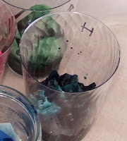
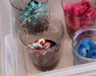
For no good reason, during the main dyeing I added dry fabric to the cups and let them stand there a few minutes before submerging them. I think I just liked the look of them all standing up like soldiers.


So the dye started wicking up the fabric, different colors moving at different rates.


It created a little streaking, that you can see here. Might be worth doing deliberately some time.

Thursday, November 12, 2009

Woolly Woolly


When my husband's brother & family moved to Seattle, I felt a responsibility to show them the sites, and took my sister-in-law to the Northwest's mecca of fiber, The Weaving Works in Seattle's U District. I haven't darkened their door in many years, but am so happy they are there.

I like to spin, but preparing fiber holds no thrill. I find raw wool rather icky. At the Weaving Works, I love the balls and balls of combed top, all clean and free of sticky lanolin, ready to slip right through my fingers into yarn. (I'm like that with bread too: I don't get off on the whole kneading thing, but I love risen dough.)

On this visit I made a new discovery: super-wash wool is available ready to spin! A washable handspun sweater? Could that be possible? It comes only in white, so I'd have to dye it…am I up for that? Since the last move (a decade ago) and having a kiddo, I haven't been near the spinning wheel. But among the many challenges of parenting is to bring back what got shelved during the diaper years.

At home, I dragged out my trusty old Ashford wheel, happy to find was that it was in pretty good shape. I got a quick tune-up from the wonderfully knowledgeable people at Northwest Handspun Yarns here in Bellingham. Another fine surprise was that my old fiber was in good shape, unmolested by moths and other forces of destruction. I spun my test bit of super-wash, and this and that from the old box. It felt nice to spin again, and to knit the new yarn into a hat.


My Portland sister-in-law makes marvelous sculptures from washed fleece and recycled sweaters and would like more colors, so I'd already been considering dyeing wool for her. After getting all my fiber reactive dyes & supplies, I wasn't wild about investing in a full set of acid dyes (dye for wool). Jacquard sells itty-bitty jars of dye, which are pricey per ounce, or big jars which are just plain pricey. Between craigslist and follow-up emails I found Nina at Rockport Rogue Island Farm (Rockportsheep@copper.net) who would sell me 1-ounce jars of dye, for $4/ounce. Perfect!

I was tired and grumpy the day the dye arrived. Next day was much the same, but maybe some art therapy would help? It did!

Lacking a quantity of the superwash top, I tried out what fiber I had, including some smooth butterscotch-colored top. Could I dye it without felting it into unspinnability?

The short answer is…YES!

My first step was to look for my old friend Hands-on Dyeing by Betsy Blumenthal and Kathy Kreider. It was nowhere to be found! I think I must have used the library's copy 18 years ago. Well thank you Bellingham Public Library, because they still have it. (I did find my copy of Hands-on Spinning by Lee Raven. It's of the same vintage, same series, and also outstanding.)

For my first dye run, I used an assortment of wool: some plain washed wool, some locks, some yarn, and some combed top. I soaked 50g of fiber in 400ml water, 100ml vinegar, and 2T salt. More solution would have been better. I was impatient, and this is only a test, so I didn't really wet it out for long enough.

I set up my old steamer with crumpled paper in the bottom of the steamer insert. That might not be necessary, but the holes in the pot look a little rusty.


I pasted up some Marine Blue, Sky Blue, Black, and Pink (Jacquard's color names), using a very approximate 1/8 teaspoon of dye and 25 ml of warm water. I lay the drained fiber on a rack and squirted dye solution from syringes. I mixed colors a bit, diluted now and then, and generally tried to get assorted shades of blue. On the fluffs of downy wool, the dye went on in litle spots, leaving lots of white. Is that the nature of that wool, or was it not really wet? It was easy to saturate the top.


I was impatient with the steaming too. I had to get Sparky to his art class, so I just turned off the burner after 35 minutes and let it sit while I was gone. Once I got home and rinsed the fiber, I was pleased that so very, very little dye rinsed off. Compared to the fiber-reactive dye, this stuff was stuck on with superglue. [Well not really. See below.]

Waiting for it to dry was so hard! I really wanted to know if the top would remain spinnable. I kept kind of poking and turning it, and trying to tell myself that this wasn't a smart thing to do with wet wool. Before bed I set it near a heater, protected from the cats.


Once dry, the top felt pretty good. I really really really wanted to spin it! Unfortunately, one of Sparky's friends recently got too friendly with the spinning wheel and snapped the rubber connector between the treadle and the footman. I called NW Handspun, who can get the part but don't have it in stock.

I placated myself by knitting up the dyed yarn, but that only whetted my desire. So I examined the situation and did a very funky temporary fix on the wheel. I've got a pin stuck into the dangling rubber and many wraps of thread back and forth between the rubber & pin and the screw on the treadle bar. It worked!


The top spun BEAUTIFULLY. It was just as smooth and fluffy as the un-dyed stuff. One thing I noticed is that the color on the top gets more evened out after that gentle pulling one does to fluff the fiber before spinning. Over all, the spun yarn has more consistent color than I was going for, but now I have a benchmark. The yarn looks like blue jeans: just that hue, and varying from dark to faded.

My goal is yarn which has color variation, but doesn't knit up stripey. Narrow diagonal stripes of color on the top might work. I like 3-ply yarn, which homogenizes the color as well.

(Note to me: a yard of that top is about 9g, from which I got 8 yards of 3-ply, approximately worsted weight.)

And here is the yarn all knit up. On the left, dyed yarn, and on the right yarn spun from dyed top.


And about that dye sticking like superglue...I was fooled. Once that dyed top became a knitted sample, look how it ran!


Maybe the dye didn't run before because there wasn't much agitation? I dunno. In the second and third rinses the water was clear. The sample made from dyed yarn didn't run like this.

P.S. I was delayed in posting this because random words started typing themselves on the screen, such as That will When Dwight and what was The are all that only neo. What is this? Some strange virus? Who is Dwight? We ran the full 3-hour virus scan, and all was well. We then noticed a leetle teeny window on the screen, and realized that somehow speech recognition had gotten switched on!

Saturday, July 11, 2009

Weighted Color Proportions

When I give a color recipe THE PROPORTIONS ALWAYS REFER TO LIQUID DYE. And my liquid dyes contain different concentrations of powdered dye depending on the color group. By changing the concentrations by color group, I'm less likely to need to use large measures for one color and tiny measures for another when I combine liquid dyes.

Reds are strong; yellows are weak; and it takes a lot of black to make black. I use less dye for the reds and more for the yellows & blacks. The blues are my standard. I add 1 teaspoon red or 2 teaspoons blue or 3 teaspoons yellow (or black) powdered dye to 320 ml (about a cup and a half) of urea water (1 cup urea to 1 quart of water). I might make the concentration stronger on certain occasions.

TO TRANSLATE these weighted proportions to actual proportions of powdered dye...

Leave the red amounts alone.
Multiply each blue amount by 2
Multiply each yellow and black amount by 3.

(You may be able to simplify at this point, for instance 3:6:9 is the same as 1:2:3.)

I use the U.S. system for dry measures and large amounts of liquid, and metric for small amounts of liquid. (Mixed up, I know, but it works for me.) I always mix my liquid dyes to a standard concentration (below), then measure out the liquid according to the proportions in the recipe.


REDS


BLUES

YELLOWS
& BLACKS

1/32 teaspoon

10 ml

5 ml

~ 3 ml

1/16 teaspoon

20 ml

10 ml

~ 7 ml

1/8 teaspoon

40 ml

20 ml

13 ml

1/4 teaspoon

80 ml

40 ml

27 ml

1/2 teaspoon

160 ml

80 ml

53 ml

1 teaspoon

320 ml

160 ml

107 ml

2 teaspoon

640 ml

320 ml

213 ml

1 Tablespoon

960 ml

480 ml

320 ml

4 teaspoons

1280 ml

640 ml

426 ml

5 teaspoons

1600 ml

800 ml

535 ml

2 Tablespoons

1920 ml

960 ml

642 ml


For the tiny amounts I use measuring spoons from a gourmet shop labeled pinch, dash, and smidge, which are 1/8, 1/16, and 1/32 teaspoons. Even so, things aren't very accurate in these amounts, which is usually OK for me. If accuracy matters, I paste up more than I need, and measure the liquid accurately.

Before getting started, I work out how much total dye I need for the amount of fabric and depth of shade I'm going for. Let's say I'm dyeing a quarter yard a dark and even purple, requiring 500 ml of liquid dye. For a color recipe of 3 parts Fuchsia to 7 parts Turquoise, that works out to 150 ml of Fuchsia and 350 ml Turquoise. I look on the chart to find the next larger amount of each color. For Fuchsia I'll mix 1/2 teaspoon powder into 160 ml of urea water. For Turquoise, I would mix up 1 and 1/4 teaspoon powder into 360 ml of urea water. I'll measure out the exact amounts and dye my fabric in it.

Monday, July 6, 2009

Oh How Red will Bleed...


So I get really impatient rinsing out dye. The studio is upstairs at the back of the house, and the washer is downstairs, and for such a small amount of fabric it seems silly to run the washer, right? Wrong.

I know that red is generally the most likely color to run, and I know I'm supposed to rinse until the water looks clear enough to drink. But do I have to? Here's some pretty clear rinse water, next to plain water for comparison.

I took the fabric rinsed in that water and set it, damp, on some white fabric. When a friend washed a red & white quilt my sister had made, she laid it out on a patio table to dry. The bits lying flat didn't bleed, but the parts hanging down over the edge did. So I set my stuff vertical, on a board. Will it bleed?


Uhh, yes.


So my lesson has been learned.

As I rinse and rinse fabric by hand, I have wondered what factors are most effective at really rinsing? What matters most? Very hot water? Lots of water? Many changes of water? Letting it soak? Agitation? Enough synthrapol (detergent for dye)?

I don't know the answer, but my current intuition is that agitation is what you want a lot of, and the washer can do that way more better than I can (or have patience for). My new approach is to:

* pull the fabric from the dye
* rinse it in the sink enough that it won't easily bleed against itself or another piece of fabric
* hang it dry not touching something else
* set it aside until I have a reasonable amount of fabric for the smallest washer load, and run it three times (with synthrapol)

And if I have some fabric that's been machine washed already, I might throw it in the washer with another batch on its second round.

When possible I've been ironing the damp fabric right after taking it out of the washer, just because it looks so BEE-OOOTIFUL all steam pressed. It's one of those magical transformations, like blocking a sweater or fulling some handwoven fabric, or pressing a quilt block.

Green, Greener, Greenest


Today's investigation concerns dye concentration. When working with something like watercolor or ink, it's pretty obvious that diluting with water will make a color paler. I thought dye was different. You put four things in a dyebath: fabric, dye, various helper chemicals, and water. I thought the depth of shade was all about how many grams of dye vs. how many grams of fabric. How long the fabric swirled in the dye bath mattered, but the amount of water didn't, beyond having enough to let the fabric move freely.

But that's all for regular dye baths, and this is low-immersion dye bath. And it would appear that the dye-to-water ratio matters. A lot.

Here's the test.I put identical amounts of green dye (1 part Fire Red, 8 parts Lemon Yellow, 6 parts Cerulean, using my weighted proportions.) into each cup, and added 10, 20, 40, 80, 160, and 240 ml of water to each cup. Each cup got a 5"x5" square of fabric. After 20 minutes I added a teaspoon of soda ash solution to each cup. Then they sat for 2 hours.


The results are clear. More water, lighter shade.


Here are the fabrics all rinsed out.


The next question was how much the amount of fabric matters. I made two concentrations of the same brown dye, one four times as strong as the other. I put a 5"x5" and a 10"x10" square in each concentration. The four cups have the same amount of liquid.


(Sorry the order isn't logical; big squares are on the outside.)

Before the fabric is rinsed out, the impact of dye concentration is exaggerated.

Here they are after washing out excess dye. Just like with the green test, dye concentration matters the most, but the amount of fabric matters too. The small squares show the impact of dye concentration more clearly. The big squares are pale and paler, so the difference is less obvious.

The two darker squares on the right both had the same dye concentration and the same total amount of dye, but the larger square had 4 times as much fabric, so it's paler. The difference is less dramatic than between the two small squares, but it matters.

The darker large square and the paler small square had the same proportion of dye to fabric in identical amounts water. The one in the higher-concentration dye-bath is darker.

This tan is 5 parts Fire Red, 3 parts Lemon Yellow, and 2 parts Cerulean Blue. It's pleasing to make a real neutral. On my screen, this looks a little pinkish, but in life is just a little too green. Next time I'll up the Fire Red just a bit.

Wednesday, July 1, 2009

Mixed Colors

Those first pure colors screamed so much that I longed to create something subtle. The resulting mixed colors look a little dull to me now, but every color has its place.


These are all the same dye, a little color I call squid ink green. The large squares are 10"x10". (Next time I'll set a quarter or something on the fabric, so you can see the scale.) The smaller square was dyed in its own cup, with diluted dye. For the one on the left I crumpled the fabric and set it on top of the liquid in which the darkest one was submerged, like this:

I made squid ink green from 4 parts Fuchsia, 2 parts Turquoise, 2 parts Better Black, and 1 part Lemon Yellow. (All capitalized color names are Dharma Trading Company's colors. Italics refer to my own creations.)


I don't usually go for salmon pinks, but that one on the upper right pleases me. Unfortunately that was improvised, no notes on how I did it. The four yellow-pink-white ones I call sun salmon squirt. Those were crumpled in a small box and I squirted some mixed pinks and yellows with a syringe.


To one of them I've already added a resist of gel glue, and it's in some Periwinkle dye bath right now.


I know neutrals are hard to accomplish because they require a precise balance. I tried my had at an ivory. It came out too definitively yellow, but not a bad first attempt. I used Lemon Yellow, a tiny tiny bit of one of the blues, and a bit of Fire Red. As the fabric went in, the dye looked the color of tea.


I LOVE THIS!!!


But have no idea how I did it. Probably a Fuchsia-Fire Red mix and some Better Black, but maybe it was some Turquoise-Cerulean mix.

Here are a few more colors, with what notes I have about their formulas:

quiet rose: 5 parts Fuchsia, 5 parts Fire Red, 1 part Better Black, 1 part Lemon Yellow.


tired wine: 10 parts Fuchsia, 10 parts Fire Red, 3 parts Better Black, 2 parts Lemon Yellow, and a pinch of Turquoise. This is very close to the proportions for quiet rose.

dull teal: some combination of Cerulean and Lemon Yellow, with some Fire Red.

lemon jade: some combination of Lemon Yellow, Cerulean, Turquoise, a little Better Black and a pinch of Fire Red.

Saturday, June 27, 2009

Super Solid Colors


I dyed over 40 sample squares on Thursday, Whew!

I started the rinse out Friday morning, and had to leave the rest until today. The last few are having their final soak as I type.

First, the single colors...


I already tested Cerulean and Fuchsia, so today I did Fire Red, Lemon Yellow, Turquoise, and Better Black. These are all the Dharma Trading Company color names. I capitalize them to indicate they are proper names. Soon I'll put all the color reference stuff in its own post.


Aren't they cute!


These are still wet and only partially rinsed out. These are 200%, 100%, 50%, 16%, 4%, and 2%, where 100% is ½ / 1 / 1½ teaspoons of red / blue / yellow-or-black dye per 1/4 yard of fabric. These are 5"x5" squares, crammed into a 2 oz cup holding about 1 oz of liquid.

Ooh those are some scary colors! The Lemon Yellow looks like it might bite, and the Turquoise could smack you right across the room. But those are primaries, so of course they scream and yell. Modulating their voices is my job.

And they aren't as bright once they're thoroughly rinsed. The Turquoise and the Better Black took the biggest hit.


I leafed through my old copy of Dye Painting (no longer in print), by Ann Johnston. She says that turquoise always washes out, making the color untrue as you paint with it. Any black that contains turquoise will have the same problem. Looking at the Cerulean before & after in this post, there's some washout too, especially in the really saturated samples. I suspect that the low-immersion dye method may leave more unreacted dye in the fabric than other methods.

Next time I'm going to keep trim off some small samples before completely rinsing.

And look what the heat of the iron does to the yellow samples...


The pair on the left have been ironed on one half and are still hot. Happily, the color goes back to normal once the fabric has cooled, as you see on the right.

Next post will show the mixed colors and the space dye stuff.

Friday, June 26, 2009

Tie-Dye Breakfast Product


This was at the end of the dye session. I folded a bit fabric and tied it loosely with a small strip of fabric Instead of squirting in color, I set the little bundle on top of some fabric in a cup of red dye.

The lower side got dark with dye...


Some of the upper side stayed white.


Opening the folds.


Spreading it flat.

Unfold...

...and unfold again.

It's a sizzling strip of tie-dye bacon!

Update two days later... Look how boring it turned out to be!


The other fabric in that cup came out like this:


I named the color tired wine. I would have thought some of that red color would be present in the bacon piece. Maybe too much of the dye had already reacted by the time I set the bacon piece on top?